Page Formatting
This section contains information about how you can use the new concepts from CSS media paged module, such as @page rules, page margin boxes, and more.
The @Page Rule
Setting the Page Size
If you do not set the size, Oxygen PDF Chemistry uses portrait US-LETTER with margins of 1in.
@page rule like this:
@page {
  size: us-letter;
}
The page
sizes can be selected by name, for example, A4, A3, US-LEGAL (these are
case insensitive), or if you are planning to print on a non-standard sheet, you can specify
the width and height:
@page {
  size: 5in 7in;
}
You can also specify the page orientation using the portrait or
landscape keywords.
@page {
  size: A3 landscape;
}
You can use the @page rule multiple times and the properties will merge as
in ordinary CSS element styling rules.
Using Page Selectors to Style the Blank, Left, Right, First, and Last Pages
There are cases where you need to have different page settings depending on the position of the page in the printed material.
@page :left {
  border-right: 0.5in solid yellow;
}

@page :right {
  border-left: 0.5in solid yellow;
}
The :first selector is used to style the first page from a sequence of
pages.
@page :first {
  border-top: 5pt solid yellow;
}
The :blank selector is used to style the blank pages that appear as a
result of forced page breaks.
Using Named Pages
In the examples above, the default page settings were changed.
Now suppose that you need to put a particular table elements on a
landscape page. The example below defines a named page table-landscape-page
that switches the orientation to landscape. Then, to maximize the space available to the
table, the margin is reduced for this page. Also, the A4 size defined by the default
@page rule is inherited by the named page.
@page {
  size: A4;
  margin: 1in;
}

@page table-landscape-page {
  size: landscape;
  margin: 0.5in;
}

table {
  page: table-landscape-page;
}
Also, Oxygen PDF Chemistry allows you to break a sequence of elements that have the same page in different page groups. A simple example is a set of chapter elements where you need to apply specific formatting for the first page from each chapter.
<chapter/>...</chapter><chapter/>...</chapter><chapter/>...</chapter>
The CSS would be:
    @chapter {
      ...
    }

    @chapter:first {
        background-color:yellow;
    }

    chapter {
      page: chapter;
    }
But this is not enough. According to the W3C specification, all chapters that have the same
page will be merged in a single page group (sequence), and the :first selector will thus
apply only on the first page from the first chapter. Therefore, you need to use the
-oxy-page-group property on each of the chapter elements.
    @chapter {
      ...
    }

    @chapter:first {
        background-color:yellow;
    }

    chapter {
      -oxy-page-group:start;
      page: chapter;
    }
The accepted values for the -oxy-page-group property are:
- start - Forces the creation of a new page group (sequence) even if the page before the element has the same name. The W3C specification algorithm (https://www.w3.org/TR/css3-page/#using-named-pages) would merge the current element with the opened page sequence.
- auto - Use the W3C algorithm normally.
Setting Page Margins
The same margin model applies to the page as for any element. The content is surrounded by padding, then a border, then margins. The page margins are between the physical end of the page and the text (if no border or padding are defined).
For example, to create a default page with margins of two inches:
@page {
  margin: 2in;
}
Or you can specify them for all the sides:
@page {
  margin-left: 2in;
  margin-right: 1in;
  margin-top: 0.5in;
  margin-right: 0.5in;
}
Or, as a common case, you may want that the inner margins of the pages of a book to be larger:
@page {
  margin: 0.5in;
}

@page :left {
  margin-right: 1in;
}

@page :right {
  margin-left: 1in;
}
If no margins are specified in the CSS, the page margins are set at 1in.
Page Margin Boxes
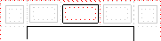
The CSS specification defines numerous rectangular areas placed in the margins that surround the content of the page. These are called margin boxes and may be used to display static CSS generated content such as page numbers, publication titles, or other artwork.
@top-left {
    content: url('company-logo.png');
    background-color:red;
}
The following table shows each of the 16 margin boxes (taken from the CSS specification: https://www.w3.org/TR/css3-page/#margin-boxes):
| Box | Description | Placement |
|---|---|---|
| top-left-corner | a fixed-size box defined by the intersection of the top and left margins of the page box | 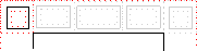 |
| top-left | a variable-width box filling the top page margin between the top-left-corner and top-center page-margin boxes | 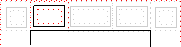 |
| top-center | a variable-width box centered horizontally between the page's
left and right border edges and filling the page top margin between the top-left and
top-right page-margin boxes Note: Using a
top-center box together
with a top-left or top-right will create a
sequence of three areas of identical width, with the top-center box
occupying the center. |
 |
| top-right | a variable-width box filling the top page margin between the top-center and top-right-corner page-margin boxes | 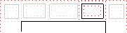 |
| top-right-corner | a fixed-size box defined by the intersection of the top and right margins of the page box | 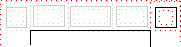 |
| left-top | a variable-height box filling the left page margin between the top-left-corner and left-middle page-margin boxes | 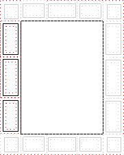 |
| left-middle | a variable-height box centered vertically between the page's top and bottom border edges and filling the left page margin between the left-top and left-bottom page-margin boxes | |
| left-bottom | a variable-height box filling the left page margin between the left-middle and bottom-left-corner page-margin boxes | |
| right-top | a variable-height box filling the right page margin between the top-right-corner and right-middle page-margin boxes | 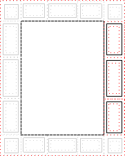 |
| right-middle | a variable-height box centered vertically between the page's top and bottom border edges and filling the right page margin between the right-top and right-bottom page-margin boxes | |
| right-bottom | a variable-height box filling the right page margin between the right-middle and bottom-right-corner page-margin boxes | |
| bottom-left-corner | a fixed-size box defined by the intersection of the bottom and left margins of the page box | 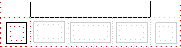 |
| bottom-left | a variable-width box filling the bottom page margin between the bottom-left-corner and bottom-center page-margin boxes | 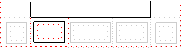 |
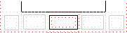
| bottom-center | a variable-width box centered horizontally between the page's
left and right border edges and filling the bottom page margin between the bottom-left
and bottom-right page-margin boxes Note: Using a
bottom-center box
together with a bottom-left or bottom-right will
create a sequence of three areas of identical width, with the
bottom-center box occupying the center. |
 |
| bottom-right | a variable-width box filling the bottom page margin between the bottom-center and bottom-right-corner page-margin boxes | 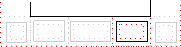 |
| bottom-right-corner | a fixed-size box defined by the intersection of the bottom and right margins of the page box | 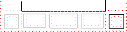 |
Columns
If you need to spread content in multiple columns, use the two CSS properties:
column-count and column-gap.
Suppose that you have an HTML section that will be shown in a two column layout, and as a special constraint, you want the title to span on both columns.
<section class='two-columns'>
    <h2>The section on two columns</h2>
    <p> The section content... </p>
</section>
You can define a page with two columns:
@page two-columns-page {
    column-count: 2;
    column-gap: 1in;
}
Then associate the section element with this page:
section.two-columns {
    page: two-columns-page;
}
To make the title span the entire page width, use the column-span
property:
section.two-columns H2 {
    column-span: all;
}
column-count and
column-gap that are set on @page rules, not on elements
from the content.